Bibigo
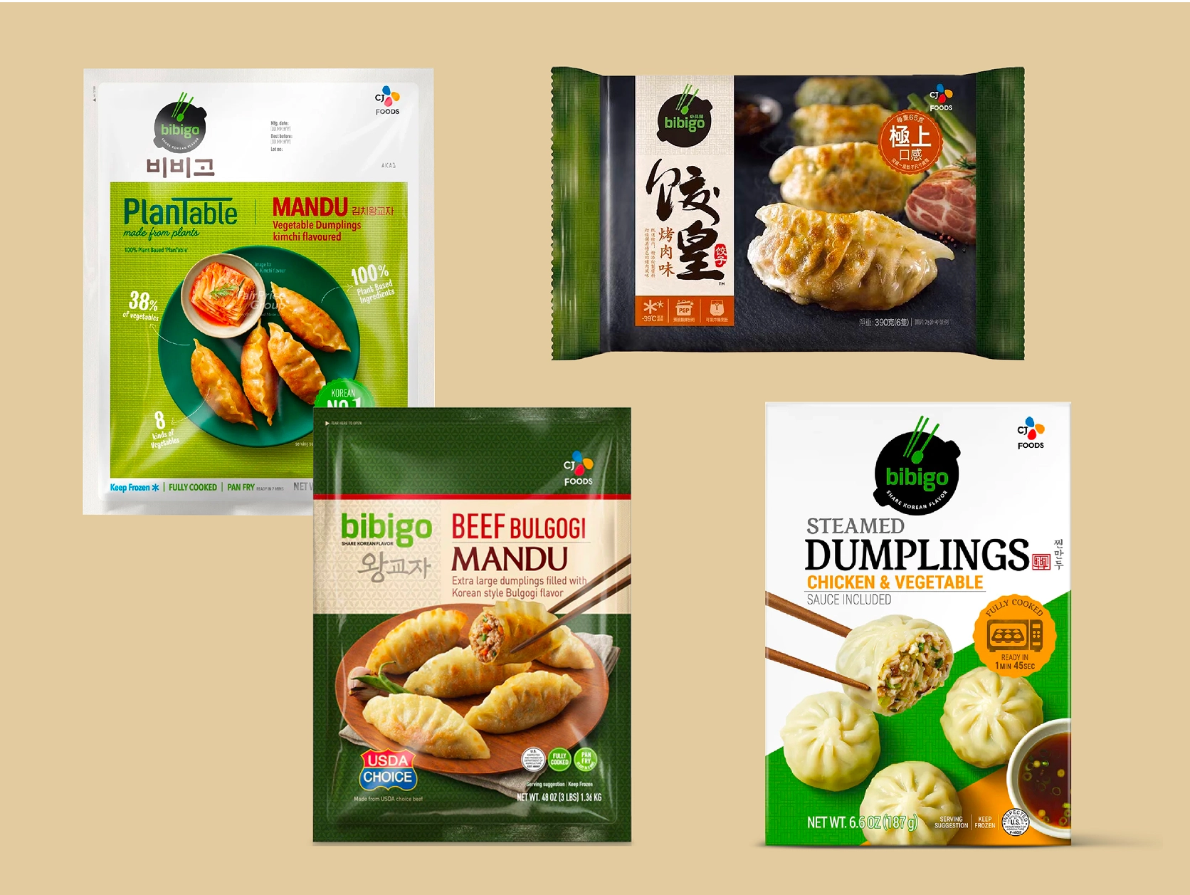
Originally launched in 2010, Bibigo is an enormously popular Korean brand, reaching passionate K-food fans in more than 70 countries. Its Mandu dumplings alone are fast approaching sales of nearly $1 billion.
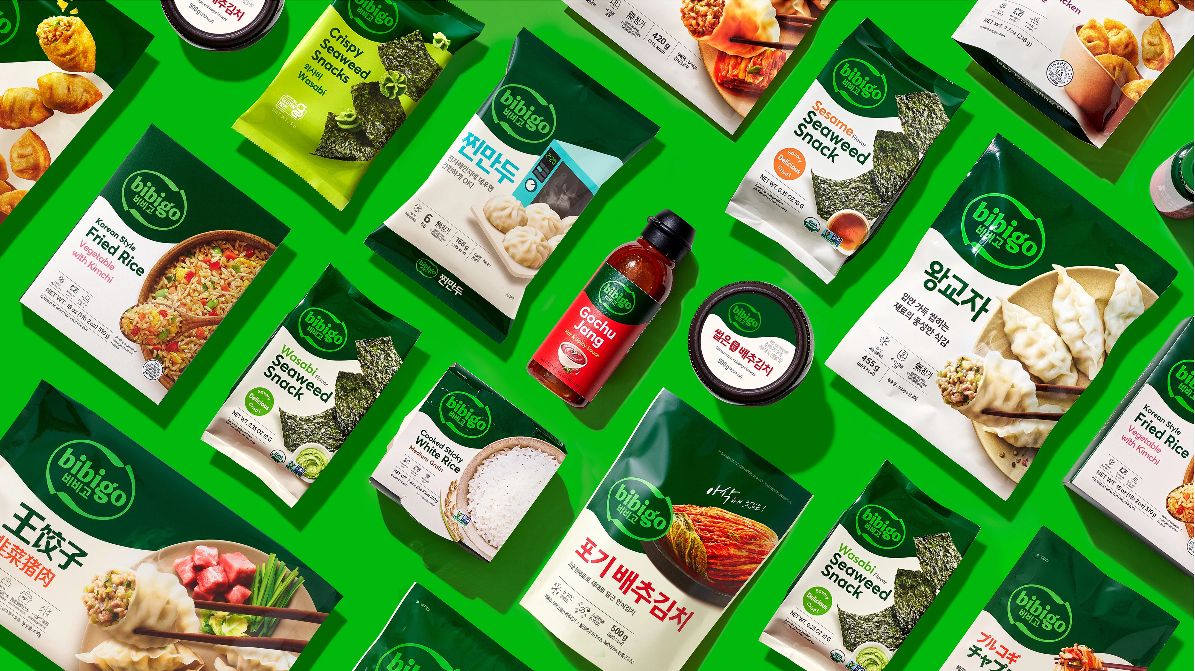
While prepping Bibigo for a new phase of global expansion, parent CJ Foods called on Lippincott to evolve the brand identity while also flexing a new global packaging architecture to put the brand front and center on-shelf, online and with Gen Z shoppers.
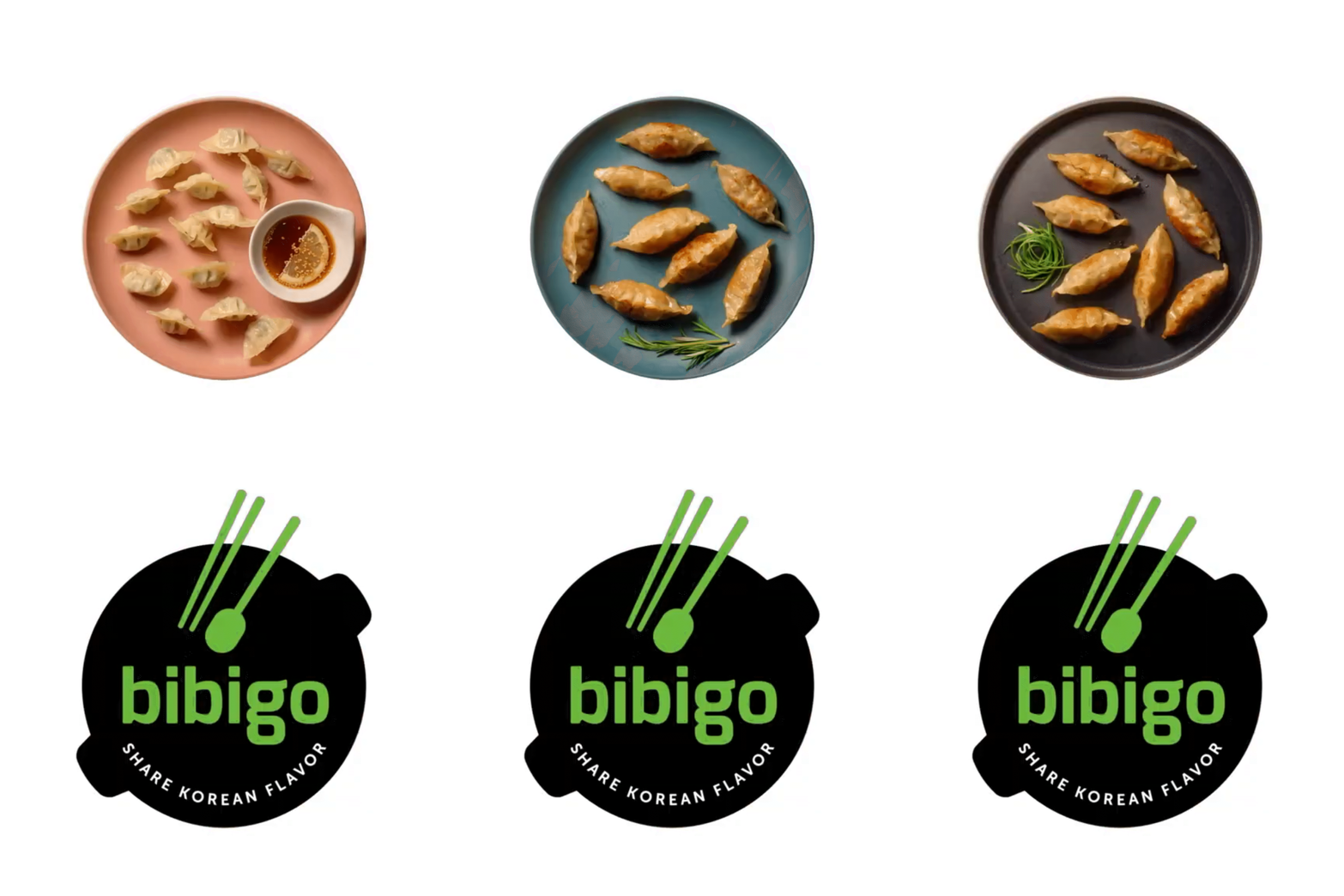
Lippincott’s first focus was the identity. Appreciating that the Bibigo name is a combination of the Korean word, bibim, which means “to mix,” and the world “go,” we developed an approachable dual language logotype contained within a shape that echoes the act of mixing up food, as in a bibimbap, and clearly expressing its genuine Korean provenance. Its circular holding shape also symbolizes how people enthusiastically pass dishes around the Bapsang.
Tackling the challenge of unifying Bibigo’s fragmented packaging system across a growing portfolio of global markets, our aim was to create a visual language that expresses the same Korean flavor, but in a more cohesive and market-relevant way.
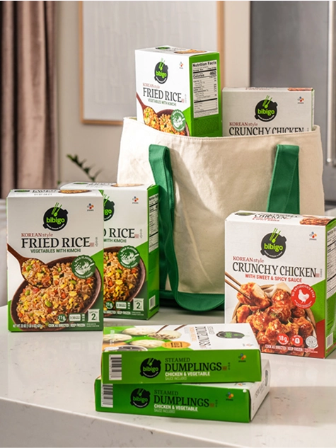
Our solution was a packaging system anchored on a brand-first awareness approach while allowing for local market adaptability. All of it centers the logo on the packaging. Together with its signature dark green color, the new packaging system does not only create impactful and instant recognition on-shelf, but consistency that can be used and recognized across markets without diluting the visual impact.
It’s a system that successfully unifies and ensures consistency across the entire collection of Bibigo’s 18 types of packaging designs, with more than 10 types of different layouts across more than 15 new markets.
The refreshed Bibigo identity, visual system and packaging system help to position Bibigo as a modern, energetic, uplifting and fun K-food brand that is loved by many.
“We have huge ambition for Bibigo globally – we want to win the world’s tastebuds. We’re on a mission to show the power that delicious Korean food has to enrich lives. Whether a milestone celebration, or a between meetings snack, every moment is an opportunity to pause and enjoy life.”
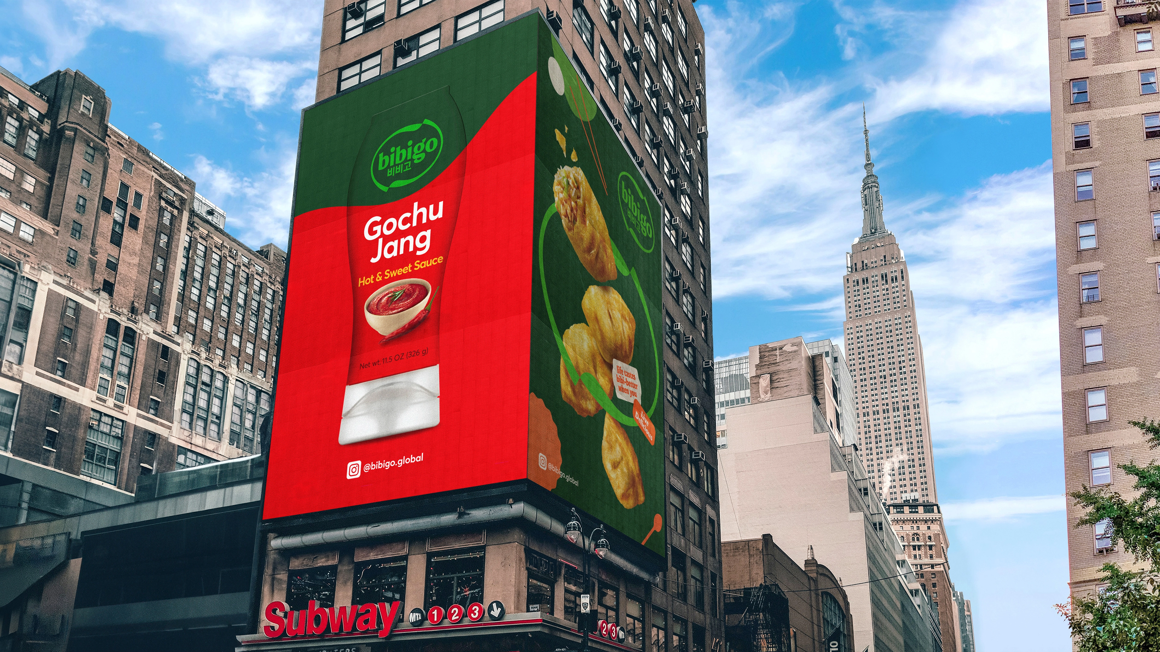
To launch the new brand, Bibigo partnered with the Los Angeles Lakers, crafting a true connection between two global cultural icons. In 2021-22 season, Bibigo became the first global marketing partner for The Lakers, not only inside the basketball court, but to collaborate on various community initiatives within the greater Los Angeles area and outside of the US, consolidating its global presence in the world stage.


