


Starbucks
Refreshing a ubiquitous brand for a future beyond coffee


An even bigger vision for one of the world’s biggest brands
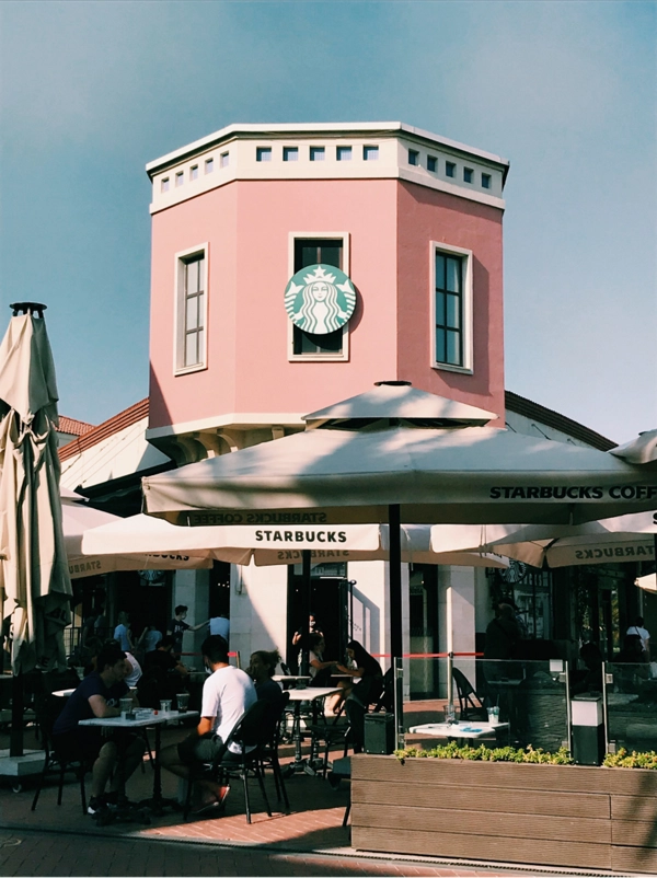
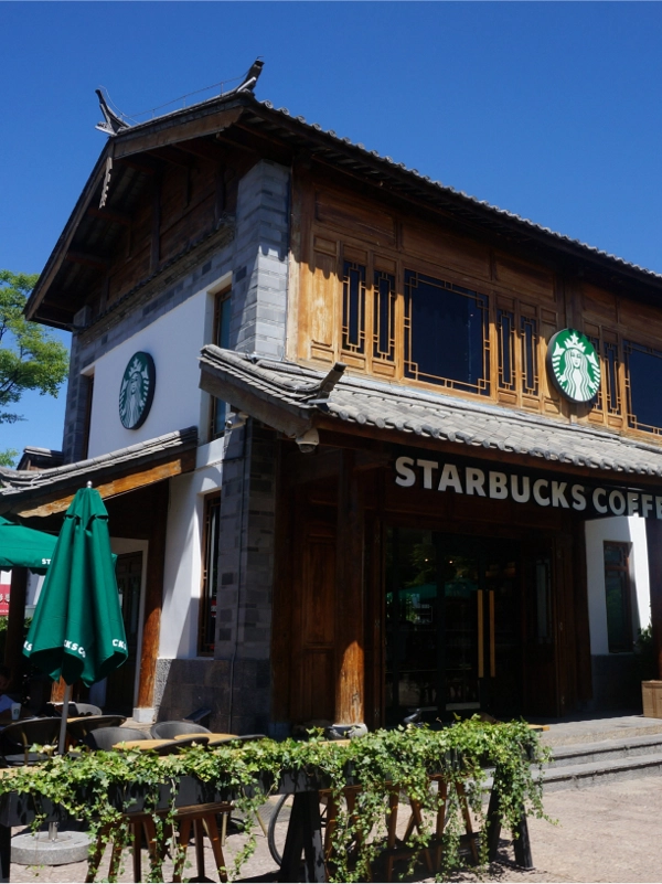
After decades of encouraging genuine and often spontaneous moments of connection within its walls, Starbucks amassed a loyal following. Millions are as addicted to its brand as they are to its product. Today, you can spot the familiar green logo in 17,000 different neighborhoods across 55 countries. In each of those distinct locations, it has moved beyond the bean and even the traditional retail concept.
Approaching its 40th anniversary, Starbucks saw the milestone as an opportunity to clarify its future vision with a reimagination of the customer experience and visual expression of its global brand.
Lippincott partnered with Starbucks to bring this vision to life all over the world, working together to evolve the brand’s three strongest assets: its celebrated product, its controlled environment, and its ubiquity in the U.S. market.


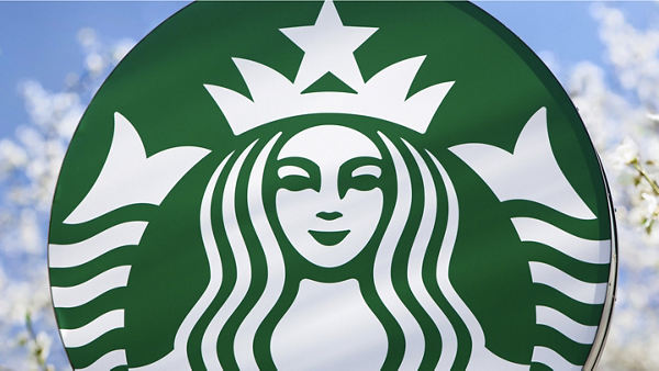
Together, we crafted a design platform that affords Starbucks the freedom and flexibility to explore new products and regional opportunities while keeping in step with its current and future customers — beginning with the logo. The Starbucks Siren has always been a figure of alluring familiarity, whether it be in our own neighborhood or on the crowded street of a foreign city. We found that updating and simplifying the logo actually opened up opportunities for the brand, and by removing the “Starbucks Coffee” banner encircling the siren, the brand signaled their departure from coffee-centricity.
“It gives us the freedom and flexibility to think beyond coffee.”
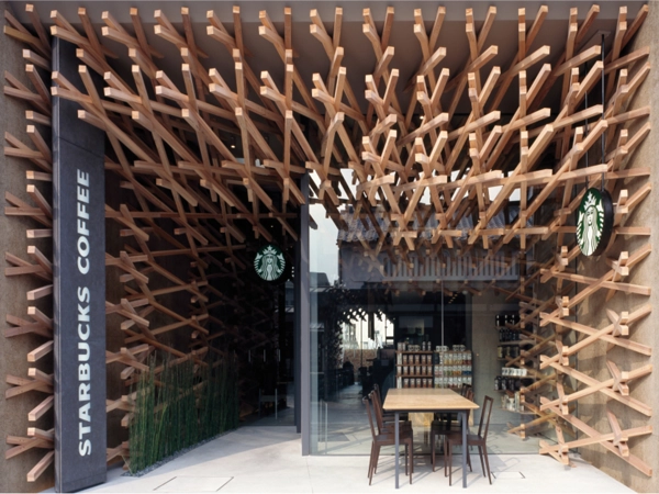
From there, the Siren became our guide as we developed a set of international design principles to help maintain Starbucks distinctive presence across increasingly varied environments. We took inspiration from the waves of her hair and the stripes in her tail.
You can find traces of the siren across the full, refreshed visual toolkit. Her wavy hair becomes a graphic pattern. The shapes in her crown adorn the credit card. And next time you open your Starbucks app, take note of the background. She’s an elusive symbol, but one that feels perpetually present. In fact, Starbucks retail stores worldwide have been stripped of obvious branding for a clean, modernized interior. The distinct Starbucks feel is achieved through the consistent application of Siren patterns across both the packaging and environmental design.
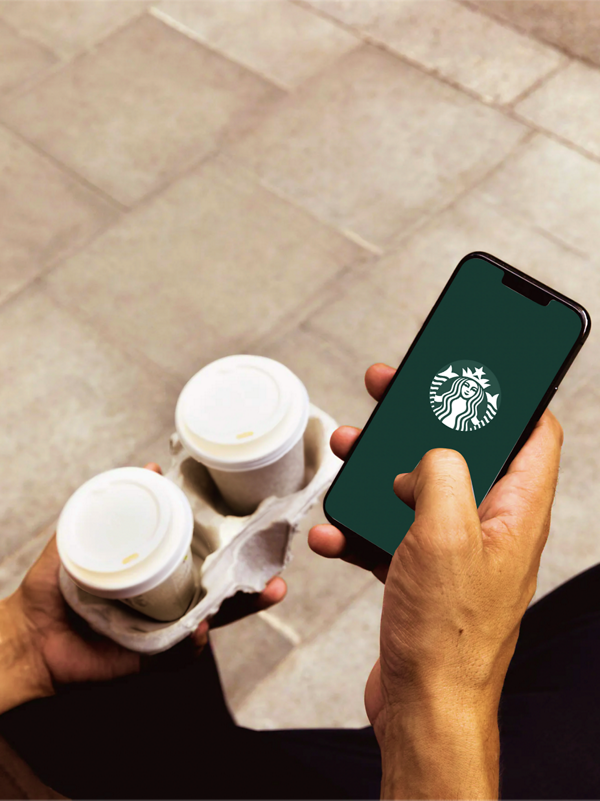
Since launching its new identity, Starbucks has reported tremendous growth, with stock prices almost tripling. The Starbucks brand continues to build relevance in key markets, including China and Asia Pacific. And the expansion of its digital offering has ushered in a new era of convenience for the customer.


