August 21, 2024
Simplicity in design has always been the mantra for anyone who respects their audience’s time and attention.
This need for clarity has only increased as our finite physical world multiplies in an infinitely crowded digital one. Cluttered environments, whether place, page or screen, trigger psychological warning signs, so simplicity is a must.
Easy, right? What designer hasn't grown up with the mantra 'less is more?' The fight to preserve white space is an age-old negotiation between marketer and maker. Space, after all, is what you find in all luxury retail environments – the ability to stop, enjoy, relax and savour is what space offers.
Yet design needs to do more than cut through this clamour. Design needs to find a way to say, 'You want me.' It’s not just about attention, it's about attraction. ‘How will this brand help me, and how does it reflect me?’
So, simplicity isn't everything. Design is the connection of the rational with the visceral, so while simple is essential… and appreciated, it's unlikely to win love. It's only the first ingredient for creating an emotional bond with a brand.
“What designer hasn't grown up with the mantra 'less is more?'”
Simplicity isn’t necessarily valuable when it comes to recognition. After all, it’s not your clearly printed, simple-to-read name that identifies you, it’s your largely illegible scribbled signature that legally does. So why would we think legibility is more important than distinctiveness when it comes to brand design?
We understand and appreciate brand design's utility, but often less importance is attached to our human desire to identify with it, believe in it, and want to be part of its world. Creating desire is a big shoe to fill. From religions to nations, the design of symbols, stories, buildings, rituals and clothing have helped define identities throughout history. Today's commercial brands also respond to these human needs, satisfying us in ways that bring connection and meaning into our lives. This is created by adding design difference, bravery, standing out and speaking differently. Appeal to our emotions successfully and we’ll let them into our homes and our lives, it’s an appeal to our emotions.
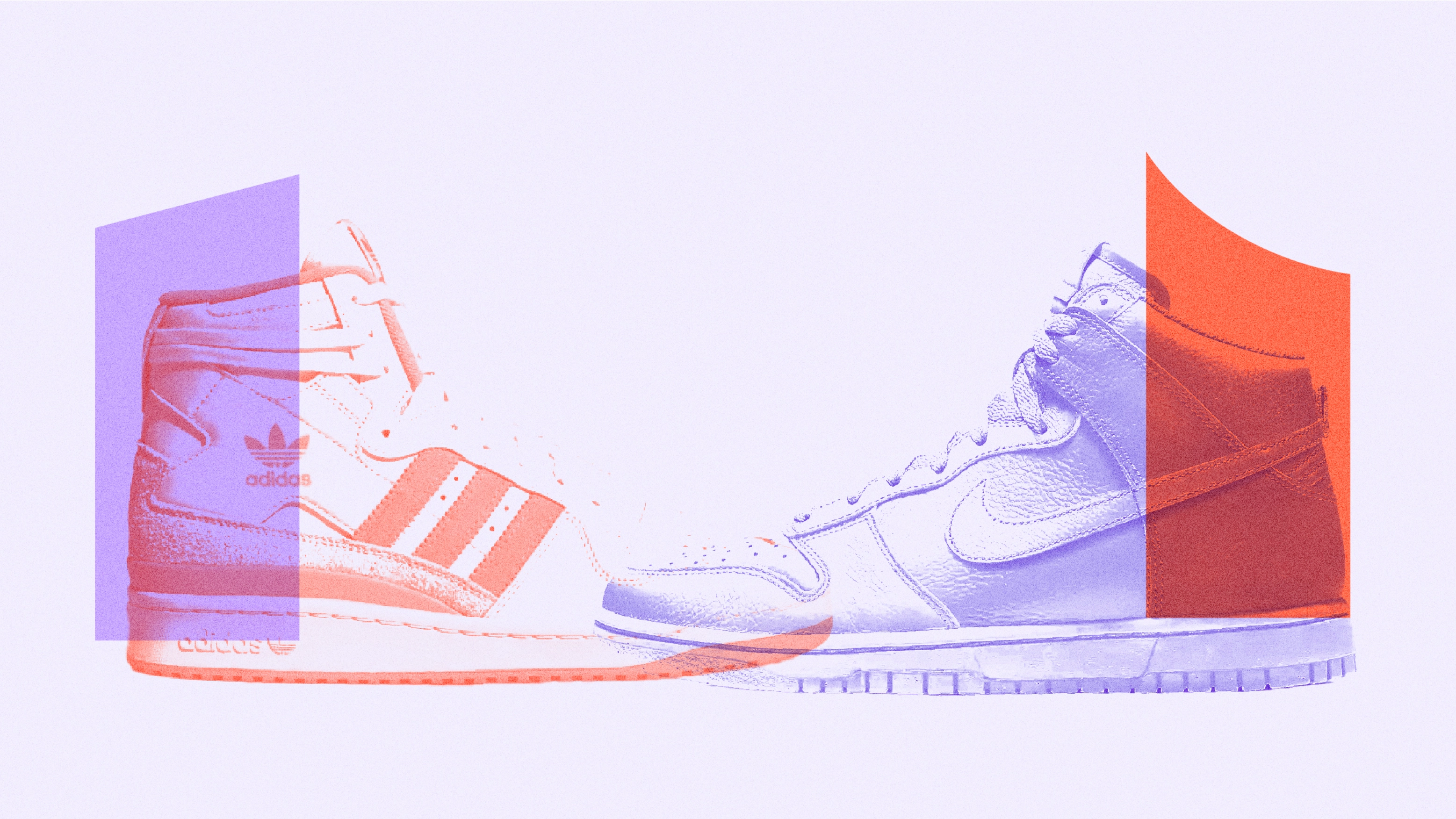
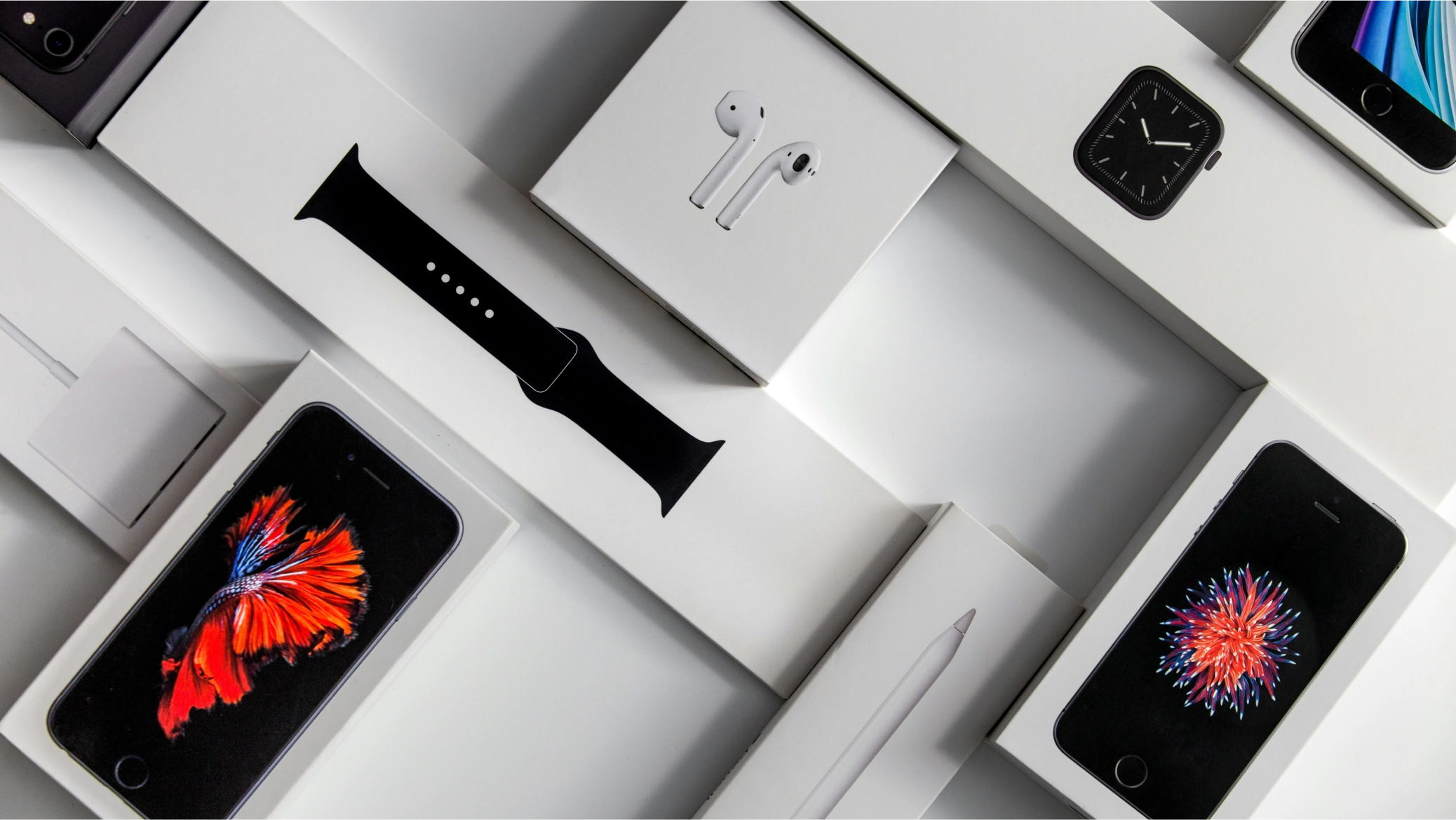
In the most successful cases, you can't distinguish the brand from its design language. Apple, Google, IKEA, and Virgin all rely on a visual language that encompasses the entire consumer experience. People notice and respond to the smallest nuances: the difference between BMW and Audi grilles, between the profile of an Adidas and a Nike high-top. We perceive these details and associate the brand values with those design gestures in the same way hunter-gatherers would have once recognised desirable prey in a forest.
Simplification without sacrificing distinctiveness is demonstrated by the Nokia rebrand. Take the logo for example, the original bold geometric logo is uncompromisingly solid and robust, exactly reflecting its durable phones. However, having not made a phone since 2013, the new Nokia needed to reflect its innovative role in the development of today’s intelligent networks. Reducing the weight of letters immediately connotes technology, while removing parts of letters plays a visual game with the viewer, allowing the viewer to complete gaps and reveal the name. This not only captures Nokia’s collaborative spirit but also suggests the invisible magic of their technology. The rest of the visual system reflects this play and interconnection of elements. Extreme simplification yet elevated engagement.
Simplification doesn't, and mustn't, mean generic, bland and undifferentiated—in a word, boring. Design must find ways to delight and visually tickle the imagination. As with many things in life, connection is more attractive than efficiency alone.
It’s a tricky balance to strike. For example, research tells us consumers love many of the new digitally enabled features in automotive design yet designers simplifying the interior to account for this, do so at their peril. While removing all those ‘messy’ buttons that used to populate the dashboard for a minimalist look, works for a brand like Tesla, most customers hate it. The physical interactions, haptic and visual appeal of switches and dials reinforce the sense of place. Mini design does a nice job of integrating the digital and physical domains to suit its brand. Less simple, but customers like and identify with it.
“Design is the connection of the rational with the visceral, so while simple is essential… and appreciated, it’s unlikely to win love. It’s only the first ingredient for creating an emotional bond with a brand.”
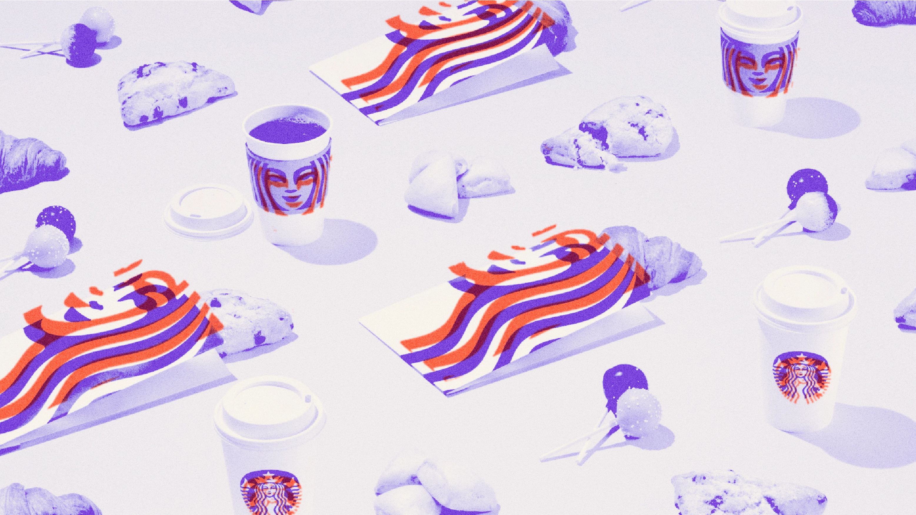
When Starbucks needed to broaden their business model beyond coffee and lose its increasingly ubiquitous feel, they began the development to a more varied flexible visual system by addressing the logo. Decoupling the surrounding name and coffee typography immediately simplified, yet doing so required the siren symbol to be used bigger and therefore better crafted. Symbolising a complex siren isn’t the conventional idea of simple yet the final result has absolutely no more than is necessary to convey the heritage and character of the brand. Additionally the drawing carries the same facial quirk that adds to make human faces distinctively their own - one side looks slightly different from the other.
There isn’t good simplicity or bad simplicity, all brands require a form of reduction. However distinctiveness is the amplification of particulars to reflect the brand's personality, allowing the audience to bond. The combination is the yin and yang of utility and uniqueness.
Our emotional bonds with design come from uniqueness - elements that make something special - not averaged. In a world of endless choice, designers need to work harder than ever to differentiate brands and create desire, finding the balance between the directness of simplicity and unexpected delight of distinctiveness. They need to go to an organisation’s idea and values for inspiration and amplify aspects of these. A Harvard Business Review study concluded that customers spend over double with brands that make them happy. To imagine this is done without sumptuous design is pure denial. While brand should lead the design, it's the design itself that we fall in love with.


